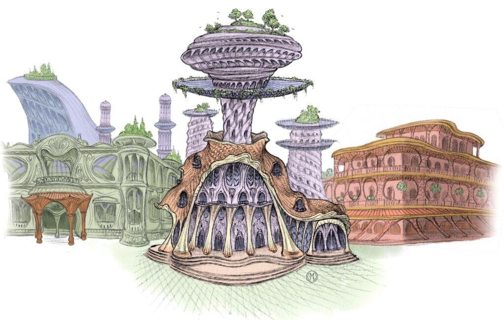
When Is the Revolution in Architecture Coming?
We need to build places we can’t stop looking at. It will involve lots of plants.
Something is terribly wrong with architecture. Nearly everything being built is boring, joyless, and/or ugly, even though there is no reason it has to be. The architectural profession rewards work that is pretentious and bland. The cities we build are not wondrous.
I’ve documented it at length before, but the problem can be seen at a glance.
Here is a classic work of Islamic architecture:

Here is a Japanese temple and garden:

Here is an 8th century Hindu temple in Indonesia:

Here is the lobby of the Guardian Building in Detroit, with mosaic patterns designed by the innovative ceramic artist Mary Chase Perry:

Here is Venice:
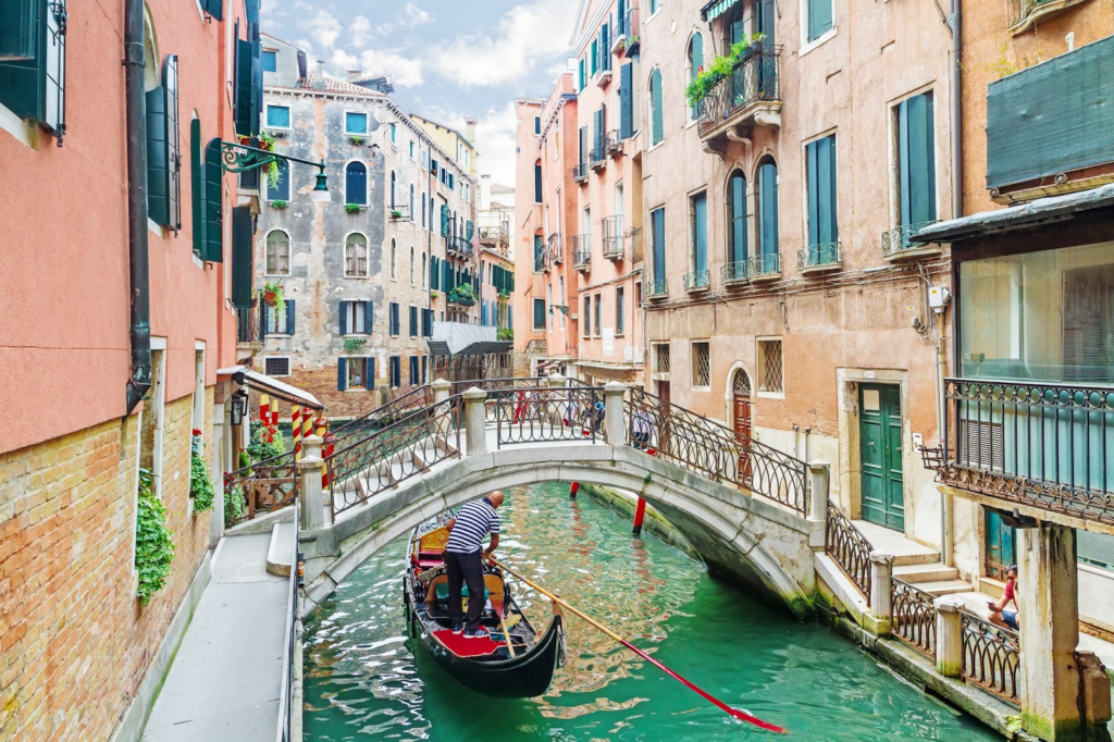
And an Italian coastal village:

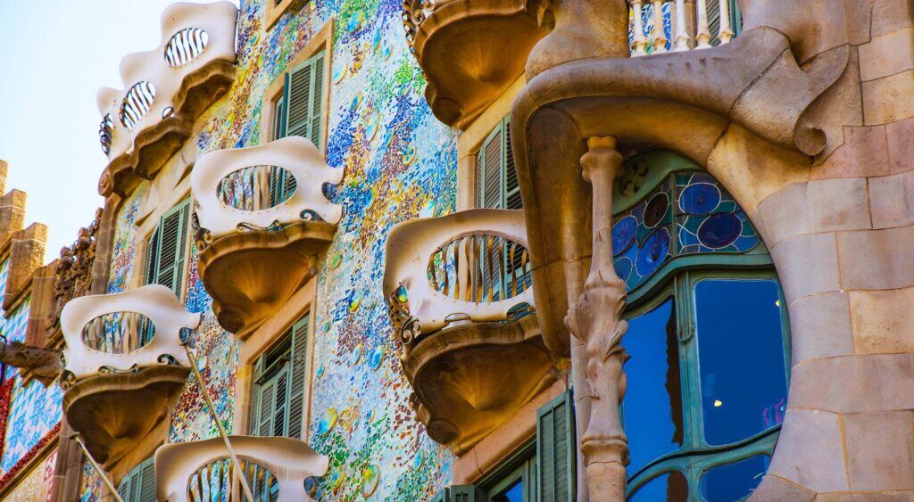
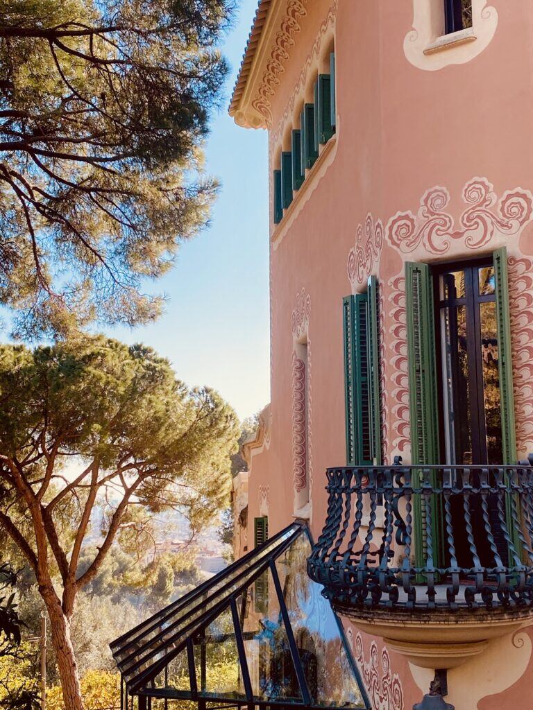
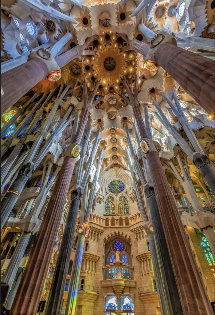
Here are a couple of works by the greatest architect who ever lived, Antoni Gaudí, whose work should have (but did not) become the jumping-off point for architecture’s continued development:
Here is a Chinese pavilion:

Now let us examine works by some of the recent winners of the Pritzker Prize, the highest award in architecture. The prize-winners are, theoretically, the greatest architects of our time, producing the most celebrated work of the era. These works are thus the best humanity has to offer at the moment.
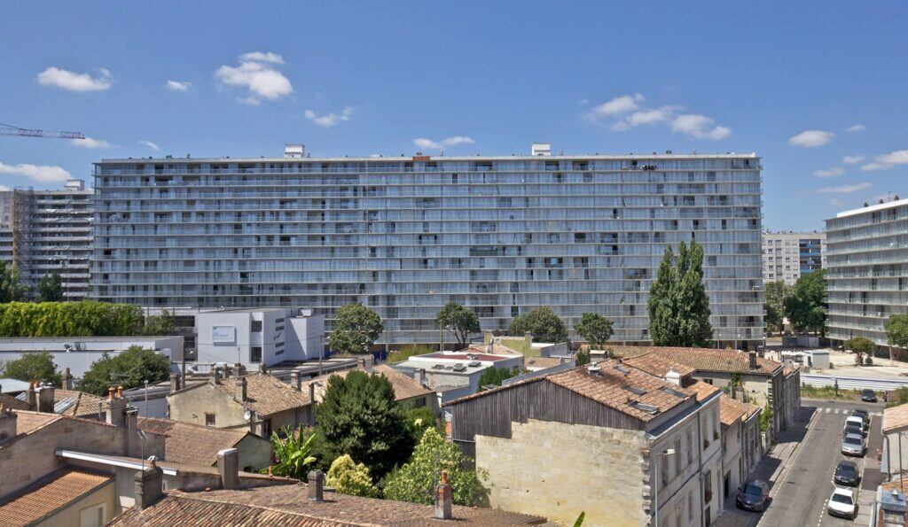
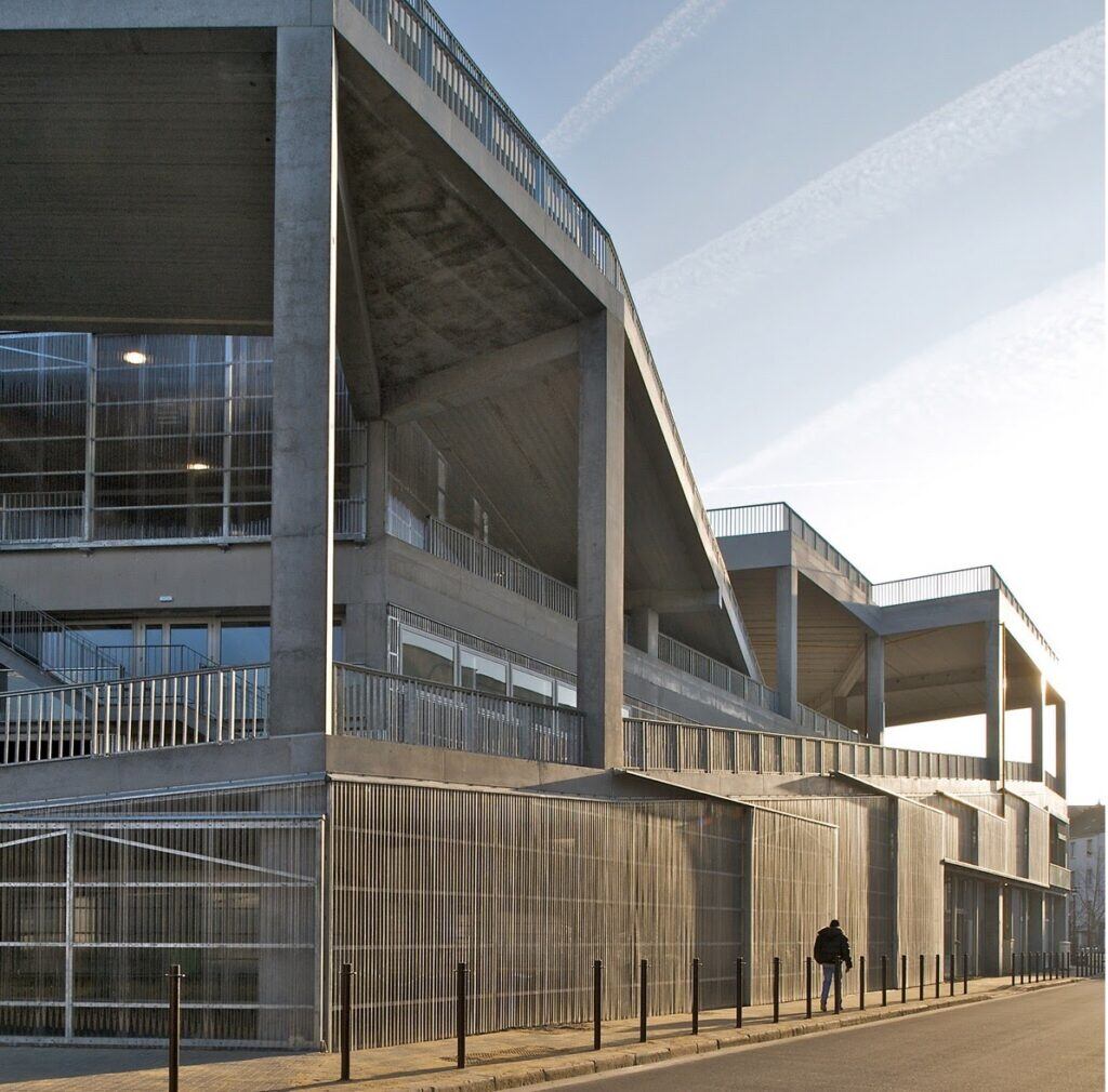
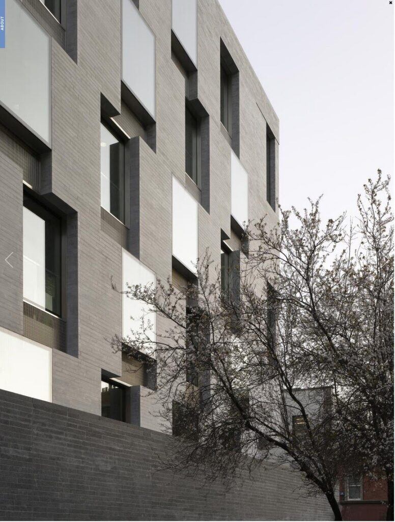
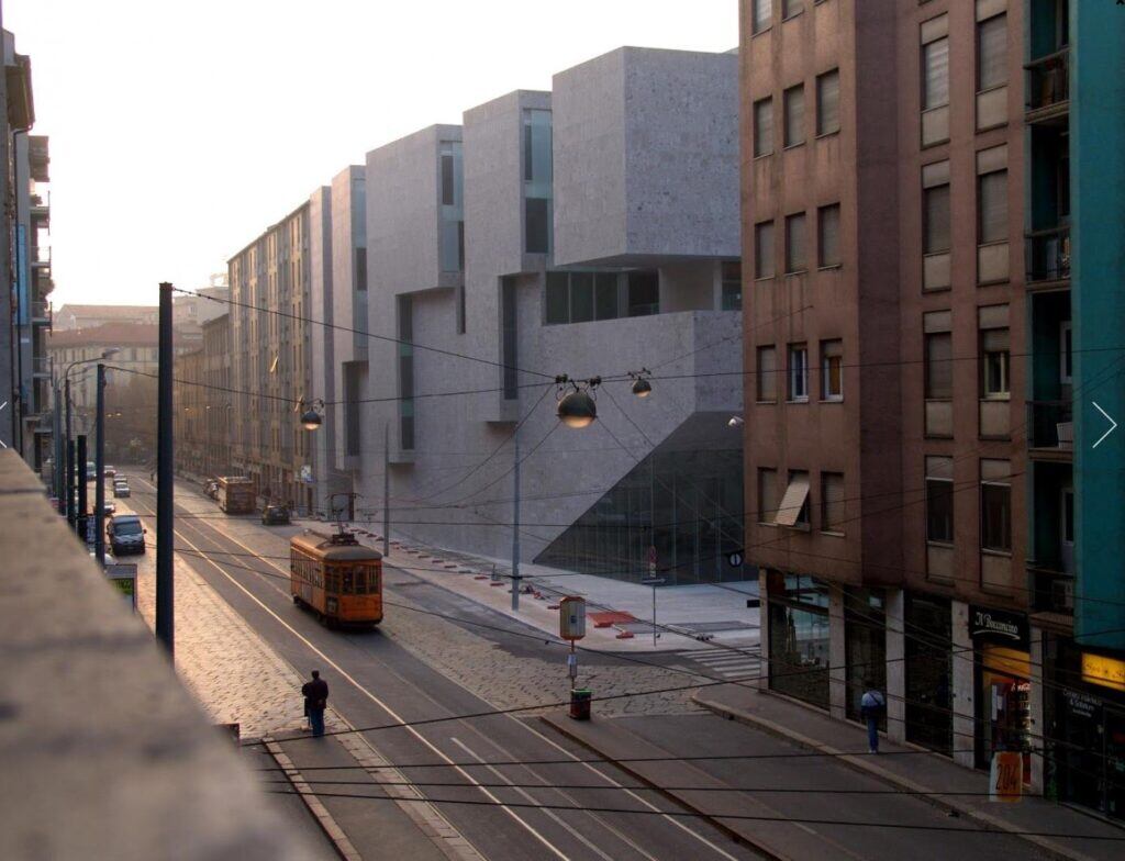

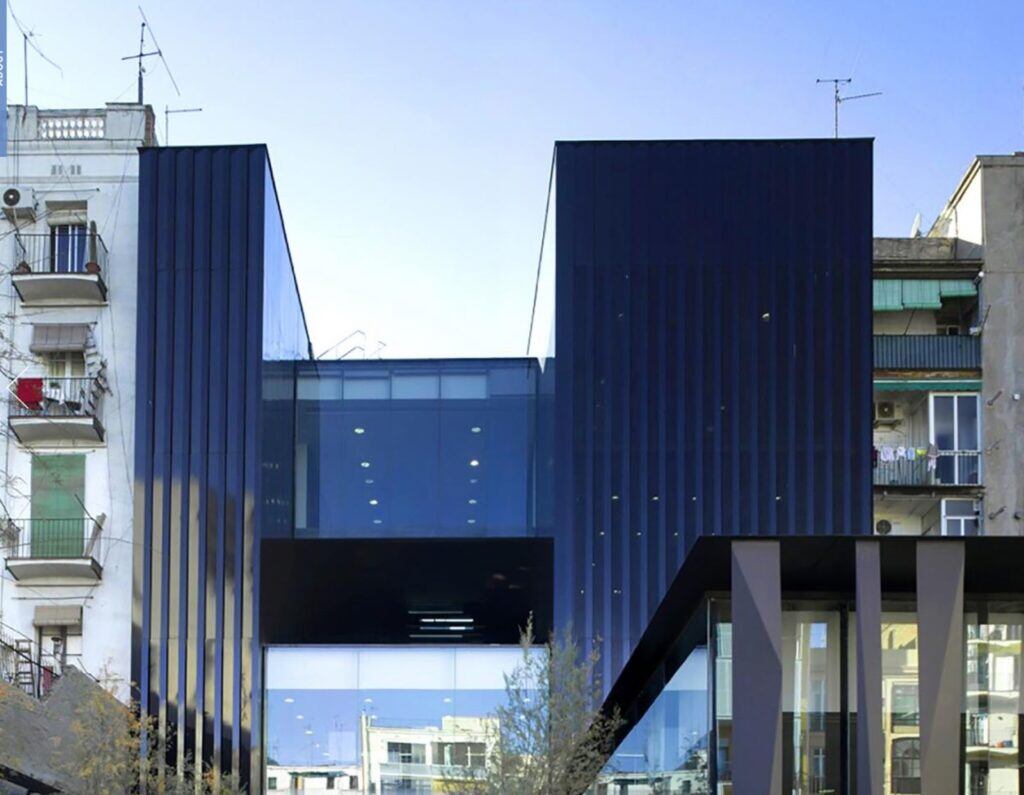
Architects do this on purpose. It gives them sick pleasure.
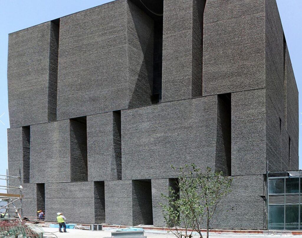
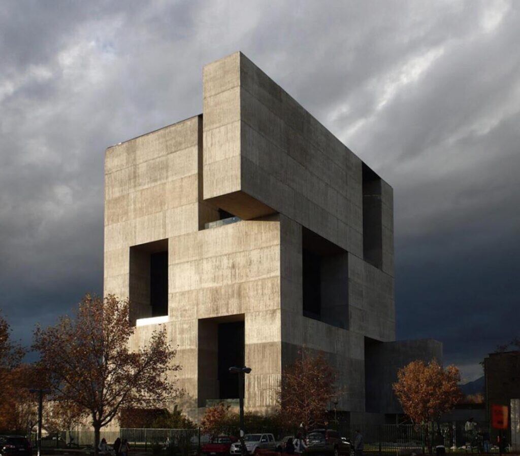
Enough. You get the picture. Now I’d like you to think of the words that come to your mind when you see these buildings, and the qualities they possess that stick out to you. I would describe them as:
- Drab
- Stark
- Monolithic
- Asymmetric
- Brutal
- Unfriendly
- Humorless
- Grating
- Boring
- Minimalist
- Arbitrary
- Lifeless
- Like you’d see anywhere (placeless)
- Disharmonious with nature
- Disconnected from history/culture
But that is not what the architectural community thinks. That last picture, Alejandro Aravena’s Angelini Innovation Center, was called by the Pritzker jury “remarkably humane and inviting.” His work is “welcoming,” they say, and “deepens our understanding of what is truly great design.” When I read things like this, I feel like I must be of a different species to these jury members, because I literally cannot see how that structure could be described as humane or welcoming. Words seem to mean different things to me and to them.
Perhaps it is that architects speak in a special language, and what looks to me like an arbitrary and ugly assortment of random stark rectangles is, to them, a kind of Morse code saying “Hello! Come inside! Happy to have you here.” But if that is the case, it doesn’t redeem the buildings for architects to have designed them using a special insider code that makes their beauty only visible to other architects.
Beauty. What is beauty? Beauty is that which gives aesthetic pleasure. Beauty is both subjective and objective—subjective because it is “in the eye of the beholder” but objective in that “pleasure” is something you either experience or you do not. If a building isn’t giving people pleasure to look at, then it is not beautiful, because beautiful things are things that you want to keep looking at because seeing them brings joy.
The fact that beauty is both subjective and objective means that a thing can be beautiful to some people and not to others. I think it is fair to say that Pritzker Prize-winning buildings are beautiful to architects, who clearly receive pleasure from looking at them. They are just not beautiful to me. I suspect they are not to the majority of people, either, or at least I suspect that the majority of people get (objectively) more pleasure out of looking at the ancient buildings of the first half of my presentation than the contemporary buildings in the second half. I believe definitive proof of this is that tourists come from all over the world to just to look at Hindu temples, Japanese gardens, the French Quarter, Venice, and Gaudi’s buildings in Barcelona. People literally plan entire trips, carrying themselves across the world, just so they can be near these buildings and drink them in up close. I cannot imagine anyone who is not an architect visiting the Pritzker Prize buildings.
Why? Is it just because the first buildings are “old?” I do not think it is. Instead, I think that people do not visit the contemporary buildings because they do not give certain feelings to the viewer, feelings that people enjoy feeling. They do not amaze, enchant, or make the jaw drop. They lack the kind of intricacy that means you can stare at them endlessly and keep finding new things. They feel dead. Architect Christopher Alexander, whose work I cite frequently, would say that they lack what he calls “the quality without a name,” which he uses to describe a certain kind of quality that places can have that gives us a certain kind of feeling that is difficult to describe but nonetheless real. Alexander argues that our subjective feelings matter, and so “word associations” assessments like the one above do matter. If a place feels cold and off-putting and you don’t want to visit it, well, it’s badly-designed, unless the purpose is to repel people, in which case it is well-designed but just strangely sociopathic.
What is missing from the contemporary prize-winners above? My own feeling is that there are a few things that spark feelings of delight in a place that are missing:
- Color
- Warmth
- Human scale
- Intricate decoration
- Lots of plants and patterns from nature
- Mesmerizing symmetries
- Sense of history
- “Places for the birds” (to be explained)
- More controversially: feelings of “life” and “beauty”
Some of this is objectively true, even if you disagree with me about whether it matters. The Pritzker Prize winners above are less colorful. They don’t have elaborate handmade mosaics. They don’t have gargoyles. They are more asymmetric. These things are not in dispute. Where it gets more controversial is the squishier feelings-based stuff. Is a place “warm?” Is it “monolithic?” Is it humane? And of course most contentiously, is it “dead” or “alive” and is it “beautiful?”
I think it’s clearly true, though, that the first set of pictures I posted are of the kinds of places that are no longer built by contemporary architects. There is a tendency toward minimalism and asymmetry. You can see the ideologies of “form follows function,” “less is more,” and “ornament as crime” in the buildings. You can see the disappearance of the kind of elaborate, nature-inspired detailing that was present in the greatest buildings across many centuries and cultures. There are no “places for the birds to live,” which is how artist Molly Crabapple describes the nooks and crannies of traditional buildings. (It’s a serious problem, too. The human-driven decline of bird populations, in addition to being an injustice against birds, has a negative impact on human happiness.) There is a fierce resistance among many practitioners and academics to returning to traditional forms, which is seen as reactionary or backward or disobeying the rule that architecture must embody the Spirit of Its Time.

I think part of the problem has been that most of the people who talk about Tradition in architecture and lament contemporary minimalist styles have been reactionaries whose values are hideous and whose idea of Tradition involves mindlessly replicating the Greeks and Italians. Books critical of contemporary architecture tend to be written by conservatives, e.g., Architecture of the Absurd by Boston University president (and lifelong enemy of Howard Zinn and Noam Chomsky) John Silber, or From Bauhaus to Our House by Tom Wolfe. Prince Charles has been a vocal opponent of contemporary architecture, and built a town that architecture critics blasted as an “embarrassing anachronism” and attempt to return to an imaginary idyllic past. (Though it’s actually kind of cool, with a wonderfully crazy and unpredictable street layout that makes it, at the very least, not boring.) Donald Trump infamously issued an order stating that federal buildings should be built in neoclassical styles, since it’s what the Founding Fathers would have wanted and is more Beautiful. The order was even called “Make Federal Buildings Beautiful Again.” The American Institute of Architects was horrified and strenuously objected.
At its worst, neoclassical nostalgia gives us the horrifying McMansion, well-documented in the brilliant McMansion Hell blog by Kate Wagner. McMansions are what happens when you have too much money and think the more Corinthian columns you put on your house, the fancier it is. The most extreme example may be the 85,000 square-foot “Versailles” mega-mansion in Florida that a local timeshare magnate has been building for over a decade.
It’s perfectly understandable to me that the right has given words like nostalgia, history, culture, and tradition a bad name, so that some cannot even hear them without shuddering a little. For many of the people who use these terms, they connote a vision that is ugly, fake, and deeply racist. I am not surprised, then, that leftists tend to prefer Brutalism to McMansions.
But it is a mistake to reject the cultural inheritance of humankind on the theory that nostalgia is for Nazis. The fact that Donald Trump thinks cheap, tacky pseudo-classical buildings are the only beautiful ones does not mean that L’Enfant Plaza is a place of majesty that induces feelings of delight in the average beholder. We should not accept the false choice between cold, discordant minimalism and Trumpian fakery. Something wholly new and much better is possible. If we can find it, it can offer an alternative to trying to relive the past.*
What that will be, I’m not sure. Personally I find some of these utopian city illustrations by Owen Carson (#1, 2, 4) and Munashichi (#3) quite inspiring. I asked the artist who did the cover for my “memoir from the future,” C.M. Duffy, if he could do a kind of “Gothic futurism” and the result definitely offers a glimpse at the kind of city I’d love to live in:

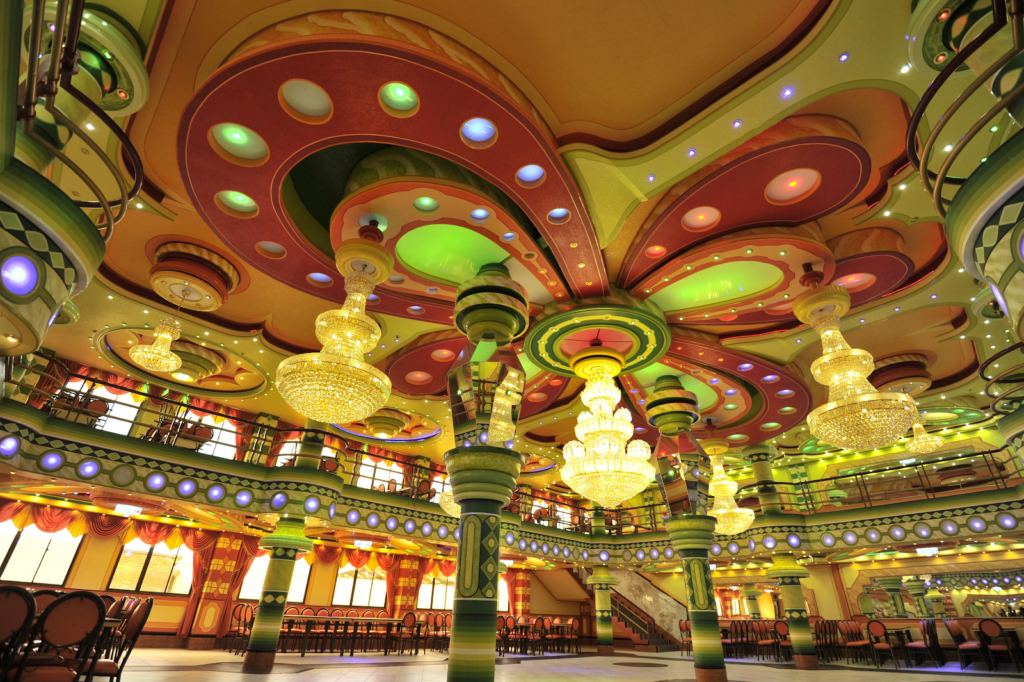
The Neo-Andean architecture that has sprung up in Bolivia during Evo Morales’ Socialist presidency has also offered a colorful glimpse at something very different to what we think of as “contemporary” without being hidebound. An example:
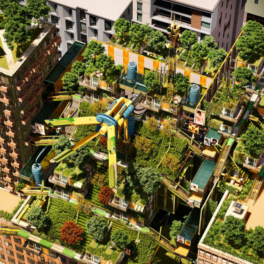
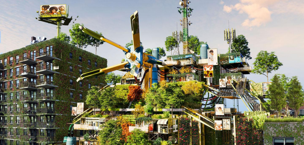
I’ve also loved some of the work I’ve seen by Afrofuturist designers, such as these by Olalekan Jeyifous:

Or these models of hypothetical cities and buildings by the late Congolese sculptor Bodys Isek KingelezI.


New Yorker art critic Peter Schjeldahl comments that “coming upon Kingelez’s work in international shows” always gave a “thrill of refreshment at the beauty and energy they radiate” as compared with much of the “blah fare” in the art world. I agree. But why should Kingelez’s style be confined to art shows? Are our real-world cities never to emanate beauty and energy? Are we forever doomed to do nothing but invent weird new shapes for the same boring glass buildings? Wow, a skyscraper that’s a big U! Wow, a wiggly one! Wow, one with differently sized rectangles! Wow, a twisty one! Wow, one that doesn’t go up in a straight line! All of these are marvels from a technological perspective, but that’s about it. They are dreary. They are culturally dead. They have no connection to the natural world.
Here’s what I like about Kingelez and Jeyifous. Jeyifous’ work is intricate. It is overflowing with plant life, so that the life within the space is just as important as anything the architect designs in creating the beauty. It is colorful. It has “human scale,” meaning that Jeyifous emphasizes the space as a space for people to live their lives and enjoy their world. It is also fun. Kingelez delights the eye. His stuff, too, is fun, and colorful. Both are richly grounded in their cultural traditions. And they don’t look like anything else I’ve ever seen.
The qualities I listed as lacking in the Pritzker Prize buildings, then, are far more present here. So, too, in the city that C.M. Duffy drew for me—while it’s sunset in the illustration, and everything is swathed in purple light, I bet those buildings are beautifully colored during the daytime. Not everything has to be colorful, of course. (It can be like this.) But the central criterion of a beautiful building has to be: does it make people not want to stop looking at it, because they are so overwhelmed with amazement and pleasure?
This will involve the return of ornamentation, something abandoned for no good reason. (Or perhaps a reason that seemed good at the time but no longer holds, especially thanks to the continued development of 3-D printing.) It will also involve falling in love with nature. One of the saddest aspects of the places we live and work in is that they are often completely devoid of living things other than ourselves. One of the moments that helped me understand what had gone so horribly wrong with architecture and design came when I was passing through the newly built terminal of the New Orleans airport and saw this:

It is a two-story picture of a tree, imprinted onto a big monolith. It is there to provide the simulation of a tree to passengers, so that they can almost feel as if they are near a tree.
But trees are a real thing. They exist. You can plant them. As I stared at the monolith, I felt depressed by what a pathetic substitute it was, and I realized that in the entire new $1.3 billion airport terminal, there was hardly a sprig of plant life. It was completely sterile and dead.
If you are among those whose instinctual reaction is “ah, but it would be difficult to put a tree in an airport,” you are only partly right. It is difficult. But it is more than doable. Singapore’s Changi Airport has an entire indoor forest with 2,200 trees, 100,000 shrubs, and 120 different total species of flora:
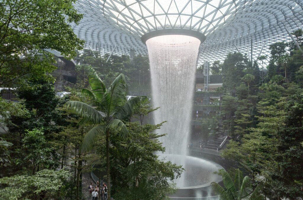
This is the sort of thing we are capable of. This should not be an exceptional airport. It should be the baseline for airports, the rule rather than the exception. (Changi has won “best airport in the world” eight years in a row.) Airports are, after all, miserable places to be. You spend hours just sitting around waiting, with nothing to look at except your phone, other depressed passengers, and the steady landing and take-off of endless flights. The presence of waterfalls and forests can relieve this. (Add cats and people will be paying just to hang out in the airport. Or hey, what about peacocks? There is no reason we cannot introduce peacocks to the city.)
There are some exceptions to the general tendency to destroy all other living things in our spaces. I am no fan of Amazon, but when they debuted plans for their new HQ building, I did note that it included something quite amazing:
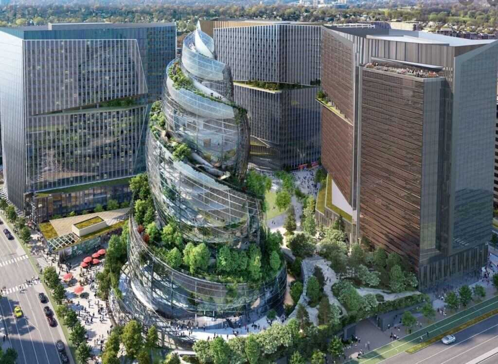
Yes, it has a wraparound garden pathway going from the bottom to the top. The building itself was laughed at, being yet another example of “what if this skyscraper was a different shape,” in this case the shape being the poop emoji. But look at those dreary office blocks in the left, right, and center and imagine how much nicer it would be to take lunchtime walks up and down the spiral garden. Again, ideas like this should be standard, not weird aberrations.
I genuinely believe that a new design revolution is possible, one that rejects some of the dogmas of the last decades about what can and can’t be done, and that breaks free of the idea that architecture has to “look like its time.” There are so many incredible possibilities for architecture, but the minimalist consensus has got it stuck in a rut, spinning its wheels, producing weird new shape after weird new shape, because people are afraid they’ll be called backward if they admit they like mosaics and gargoyles and friezes and stained glass and other cool stuff. I like pretty colors or I like old things makes you a child, an idiot, someone to be laughed at.
That’s no exaggeration. I’ve published many controversial opinions, but the most vitriol I get is actually not from fans of Ben Shapiro. It’s from architecture snobs who think it is wrong and bad to have a negative reaction to things they have deemed correct. It’s truly vicious. If you’re going to join those who publicly admit they don’t like contemporary architecture, you’re going to be called stupid and reactionary and completely missing the point. The consensus is so strong that new buildings around the world all mostly adhere to the Big Shapes school of design. (Interestingly, something equivalent has happened in editorial illustrations where everything has converged into a uniform blobby minimalist style, though it is not so extreme as in architecture.) But there is some hope. In 2019, I mentioned a movement called New Maximalism, which I thought I was making up (I even excerpted a fictitious New Maximalist manifesto of my own drafting). But perhaps it was not as fictitious as I thought. Now, according to Vox, New Maximalism is actually here. It has so far been confined mostly to Instagram accounts about home decor. It has not yet spread to architecture. But the tide is turning.
So, architects, be bold. Go crazy. Gothic futurism. Do it. They’ll call it pastiche. They’ll say it’s ignorantly recycling the past. Whatever. Screw ‘em. Let’s see what wonders can be created if the rules are broken and we start up again where Art Nouveau left off. Study the past closely and take whatever you like from it. Or: let’s create places that are like playgrounds. With rope bridges and secret tunnels and slides. Why the hell not? We’re supposed to be able to produce more, and more efficiently, than ever before. So always add waterfalls, because the sound of flowing water is pleasant and will improve everyone’s lives. If no waterfalls, then your building is no good. There is no reason not to expand our imaginative capacities as far as they will go. Dare to dream of something that looks completely different to what you see all around you. Something dazzling and surprising. Something breathtakingly beautiful.
*I vigorously support the Campaign To Rebuild The Original Penn Station, for instance, because the gorgeous original design is so superior to anything a contemporary architect has come up with. But I don’t have some obsessive desire to restore the old one because it is old. If it were possible to make something better than the old one, something even more beautiful and fresh, I would want that over the restoration of the demolished station. But contemporary architecture happens to be godawful, so in this case the best available option is to put it back to its stunning original design. Nobody need be nostalgic if we can create something better, but we don’t seem able to, so nostalgic we must be.
Note: I have set aside for the purposes of this article the fact that our ugly buildings are all capitalistic megaprojects and thus we cannot change our design until we change our economic system. I am only here trying to get us on the same page as regards the vision, since many leftists still insist on trying to get me to sign onto the depressing Fuck Yeah Brutalism position.


