If Taco Bell Is The Peak Of Our Civilization, Get Me Another Civilization
I refuse to believe that this is the best we can do…
Bowtie-wearing libertarian Jeffrey A. Tucker, of the Foundation for Economic Education, is a cartoonish specimen of the Free Market Think Tank world, with capitalistic beliefs so extreme and Mr. Burns-like that one struggles to accept that he is an actual human being rather than a fictitious algorithm programmed by someone who despises me and is trying to give me an aneurysm. A good number of his thousands of articles are devoted to the giddy celebration of everyday consumer products, e.g., “The Power and the Glory of M&Ms,” “My Romance with My Digital Home Assistant,” and “How Pokémon GO Brightened a Dark World.” But there are also examinations of how children’s movies show the need for a fully deregulated market, e.g., “The Message of ‘Trolls’ Is Not Unlike ‘Atlas Shrugged’” and his excavation of Zootopia’s “deep critique of the state.” But, as always with capitalist philosophers, there are plenty of more sinister items, like “Let Airbnb Providers Discriminate as They Please,” stern warnings not to tick off your boss, instructions on how to be a diligent and compliant subordinate, and insistences that “getting fired is one of the best things that can ever happen to you, if you look at it the right way.” (Don’t think of it as losing your health insurance, think of it as gaining freedom from your insurance.) Tucker’s most demented piece is “Let The Kids Work,” an argument that kids love dangerous work, children were sent down mines because they were “valued as people,” and child labor should be brought back:
The Washington Post ran a beautiful photo montage of children at work from 100 years ago. I get it. It’s not supposed to be beautiful. It’s supposed to be horrifying. I’m looking at these kids. They are scruffy, dirty, and tired. No question. But I also think about their inner lives. They are working in the adult world, surrounded by cool bustling things and new technology. They are on the streets, in the factories, in the mines, with adults and with peers, learning and doing. They are being valued for what they do, which is to say being valued as people. They are earning money. Whatever else you want to say about this, it’s an exciting life. You can talk about the dangers of coal mining or selling newspapers on the street. But let’s not pretend that danger is something that every young teen wants to avoid… If kids were allowed to work and compulsory school attendance was abolished, the jobs of choice would be at Chick-Fil-A and WalMart. And they would be fantastic jobs too, instilling in young people a work ethic, which is the inner drive to succeed, and an awareness of attitudes that make enterprise work for all. It would give them skills and discipline that build character, and help them become part of a professional network.
But I don’t want to dwell on Tucker’s defense of child labor, largely because I trust that a good majority of the Current Affairs audience already shares my belief that there is nothing “beautiful” or “exciting” about sending an eight-year-old down a mine shaft, and that the kind of “danger” children enjoy is not “the danger of getting black lung before puberty.” Instead, I want to look at another one of Tucker’s delusional dystopian beliefs: his philosophical defense of Taco Bell.
Tucker believes that Taco Bell offers a vivid illustration of everything that’s wonderful about capitalism. (He even recommends getting married in a Taco Bell, which you can do in Las Vegas.) The chain, he says, is a triumph of the free market, a thing of wonder:
This is the market at work. It has gathered corn, flour, beans, tomatoes, meat, and fresh lettuce from all the ends of the earth, combined it with advanced kitchen technology, added experienced management, brilliant entrepreneurship, and a service ethic to give us something more wonderful than that the teller of tales of yesteryear could have ever dreamed up in his wildest imaginings.
Ah, but that’s just the structure of Taco Bell. It’s nothing next to the experience of a Taco Bell. Tucker admits that this “experience” consists of being shown pictures of beautiful food and then being given food that looks nothing like it, but says this doesn’t qualify as disappointment because “you can’t eat a picture”:
Next time you are there, take a close look at the gorgeous photography of the dishes themselves. There’s never been a prettier taco, never been a burrito that looks more exciting, much less a plate of nachos that seems as if every chip is practically dancing with joy at the prospect of being eaten. Now, the usual response is to point out that the food doesn’t actually look this way once it arrives on your plate. No kidding! But does anyone really care? Not really. The point of the images is to get you in the mood to eat the thing, rev you up into the spirit of the moment, create that deep sense of longing for the real deal. You don’t feel a bit of disappointment when the food doesn’t look like the picture, and why? Because you can’t eat a picture. And the food is right there in front of you ready to be eaten.
But it’s in his celebration of the restaurant’s architecture and design that Tucker truly outdoes himself, suggesting there is something of the spiritual and the sublime to the experience of entering a Taco Bell:
The company obviously puts a great deal of thought into the ethos of the restaurants themselves. The decor gives us things to look at that we don’t see anywhere else. The colors are all those we associate with the Southwest, but not in a conventional way. The shapes are geometric and modern, with a daring flare that delights the eye and fires up the imagination. The details around the place add to the sense of adventure, but you don’t take note of them individually unless you are looking closely. The backs of the chairs all have a bell shape cut out in the steel. The lighting is not mainly in the ceiling but rather comes from orange hanging glass lamps in the shape of cones.
I was trying to think where I had seen this before. Is it like the nave of a chapel in a monastery in a Spanish mission territory? Maybe that’s it. I’m unsure but it conjures up something different. Hold on here. Perhaps you have already realized this and I’m slow on the take, but the whole Taco Bell experience is suggestive of that Spanish mission sensibility. That’s why the buildings are shaped the way they are. And, obviously, that’s the whole meaning behind the bell, and why it adorns the front entrance of the place. It’s a church bell! It taps into something deep and lasting in our cultural sensibilities, something that shaped our ancestors and their communities, and presents it all anew in our times.
Okay, enough. (I won’t quote from his published views on McDonalds, but needless to say, he his enthusiasm for the McMuffin borders on the lascivious.) Tucker likes Taco Bell, as you can see. But there’s also something in here worth dwelling on, because it reveals very nicely why I am aesthetically as well as morally revolted by capitalism, and what I think is being missed by those who get overcome with tingles whenever they think of the free market.
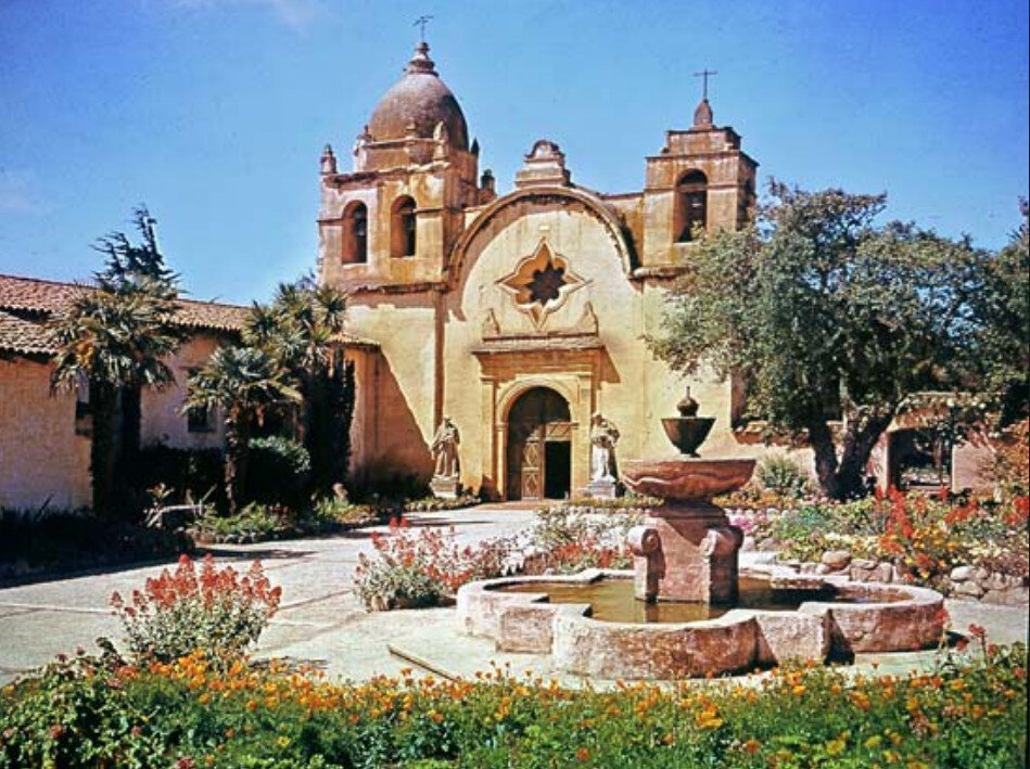
If the aesthetics of Taco Bell have a “Spanish mission sensibility” that “taps into something deep and lasting,” it is worth remembering what actual Spanish mission architecture is like. (Uh, as well as what the Spanish missions actually did.) Artist Chandler O’Leary has toured Southern California producing paintings of the old missions in her notebooks. Here is what they look like:


(O’Leary’s whole series is lovely. She sells prints, too!)
Now I would like to show you a picture of a Taco Bell. A Taco Bell looks like this:

At its most attractive and Spanish-y, it looks like this:

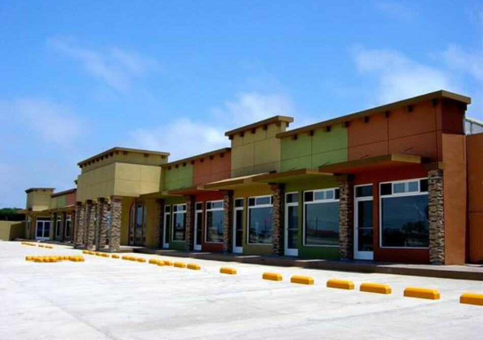
But nowadays, thanks to contemporary architecture, they tend to look like this:

And lest you think I am being unfair to the Taco Bell by putting it against O’Leary’s paintings rather than an actual photograph of a Spanish mission, I present you with this:

What I’d like to dwell on is the difference in “aesthetic logic,” because I think the difference between the look/feel of a Taco Bell and the look/feel of the courtyard of an old Spanish mission arises in part from the difference between the motives of their designers. Tucker is right that a lot of “thought” goes into the design of a corporate identity, and he accurately describes the branding process. If a company hires a design firm to redo its aesthetic identity, they will think hard about how to “conjure associations.” We chose this color palette because it suggests Mexico, this bell because it suggest church, etc. If I run a concrete company, a designer might give me a logo made from a letter with a thick bottom to suggest a “solid foundation.” (Lots of corporate logos have hidden meanings, and the fact that you’ll be surprised by many of them may show just how little they actually succeed in creating the associations designers intend.)
“Corporate aesthetic logic” operates according to the same “efficiency-maximizing” ideology as neoclassical economics: It tries to get the massive possible “associative power” from the minimum possible expenditure of resources and design elements. So Taco Bell is not actually going to build bell towers on each of its 5,600 locations. It will have a picture of a bell, located in a way that “suggests” a bell tower. It’s not going to actually have a beautiful courtyard like an old mission building, but it might have, say, an arched window and a bush, in order to reproduce some of the simplified elements of a mission building.
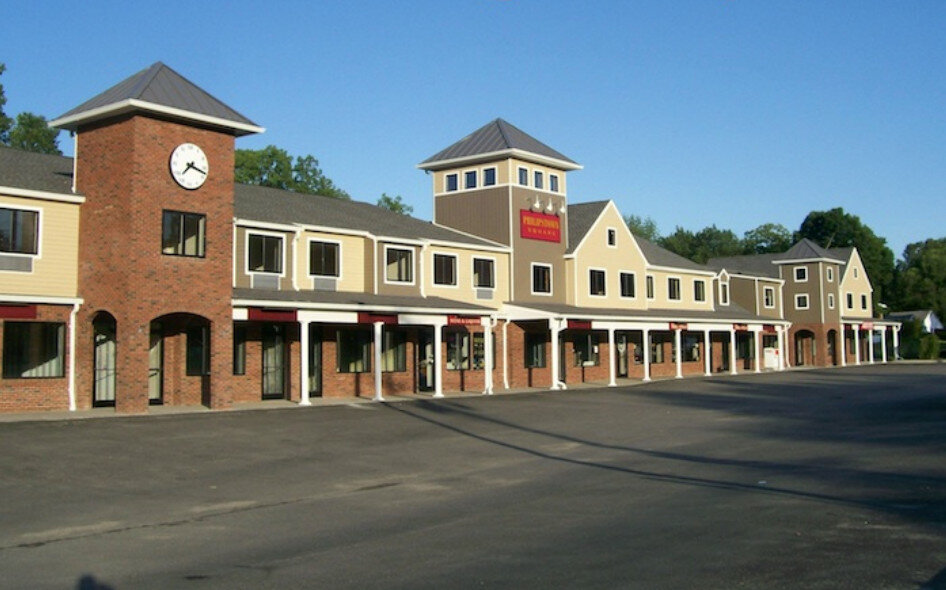
This attempt to use a few spare elements in order to stimulate an association is present a lot in strip mall architecture, which often tries to remind you of an old city block or a New England fishing village. It does this not by being like these things, but by adopting a couple of their elements, such as by arbitrarily varying the height of its facade, changing the colors of certain segments, or adding a fake clock tower. (We can call this particular style “Neoliberalist Architecture.”)


This kind of design (which you can call “postmodern-derived,” if that means anything, which it doesn’t) has always depressed me a lot. It’s bad for the same reason that McMansions are bad; they don’t actually try to embody the features that make traditional architecture so beautiful. Instead they just slap a few Corinthian columns on the front of a box and punch as many windows in the facade as possible. There is a relationship between Taco Bell architecture, strip malls, McMansions, Disneyland, and Taco Bell food: Each is a superficial replica of an actual thing, that gives some hint of the original while sacrificing nearly all of the qualities that made the original impressive.
We can call this “inauthenticity,” and many people have criticized capitalism for replacing authentic culture with mass-manufactured imitations of authentic culture. But I don’t actually like the word authenticity much, because it suggests some kind of mystical essence that can be lost, and I don’t really believe in mystical essences. In fact, we don’t even really need the concept: It’s enough to remember Tucker’s description of the difference between the picture of the Taco Bell food and the food itself. Why do I dislike capitalism? Because I dislike lies, and there are in fact places where the picture of the food looks like the food itself. There are places where you can go and sit in a leafy courtyard rather than sit next to a wall painted in a way that’s designed to remind you of a courtyard.
Why are the Spanish missions so much more beautiful and pleasant to sit in than a Taco Bell? In part, I think it’s because the people who designed these buildings were not capitalists. The most impressive buildings in the world are those that were built out of religious feeling, and I don’t think that’s a coincidence. I’m not religious, but I do think there’s a difference between the type of building you build if you’re trying to impress God, and the type you build if you’re trying to maximize your revenue and minimize your expenditures.
The great 19th century socialist William Morris, of the Arts and Crafts movement, cared a lot about producing aesthetically perfect objects. He wanted a world in which every object was “a joy to the maker and a joy to the user,” that would be “beautiful as well as useful, and…communicate to its user the pleasure that its maker had in producing it.” One of the reasons that mass-produced objects, designed according to a profit-seeking formula are disappointing to people of my sensibility, is that they do not “communicate the pleasure that the maker had in producing.” Tucker loves the art on the walls at Taco Bell. I don’t, because I don’t appreciate the motives and process through which it was made.
Consider Hollywood. The worst Hollywood films are the ones made according to studio executives’ formulas, with purely financial motivations. We know X person is hot right now, and that there hasn’t been a buddy cop film in a while. Truly great films tend to arise when a skilled team of people is put together to produce the best thing they can think of. The big myth of capitalism, of course, is that markets tend to automatically produce the best things, because they automatically produce the things people will want the most, i.e., the things that maximize their utility, i.e., the optimal things. But this is precisely the logic that has produced this:

Because it turns out that most people actually have limited options, and even though they might prefer a beautiful courtyard in which to eat their chalupas, that is not one of the available options in their particular suburb.
There’s a building I particularly dislike in New Orleans. It’s possibly one of my least favorite in the world, though I doubt many others would share my unique displeasure. It’s the Homewood Suites on Rampart Street. It looks like this:

Why do I hate the Homewood Suites? It’s fine. Well, I hate it because it perfectly epitomizes the aesthetic logic of capitalism. Whoever designed it knew that it was going next to the French Quarter, and that people would want that “New Orleans feel.” They gave it that “feel” by varying the facade in order to simulate the look of a New Orleans city block, and slapping on a balcony or two, because the French Quarter has balconies. The actual French Quarter, let us remember, looks like this:

Each of these buildings has history. Each has been adapted by individuals, who were thinking about what they wanted their building to look like, rather than “what would convey ‘New Orleans.’” The Homewood Suites has the bare minimum number of balconies necessary to prove that it’s “French Quarter-y.” The actual French Quarter has the number of balconies that people wanted on their buildings. The differences may be subtle, but it’s in those subtleties that I find everything I love about the world. Take them away, and all you have is a sad, hollow replica. It’s the architectural equivalent of the shit on the walls of a Cracker Barrel, or 37 pieces of flair: an effort to create the impression of caring without actually caring. Why do people like “mom and pop” establishments? One reason is that, when you’re in them, you know that somebody in the store has set up the display because it’s how they like it, rather than because it’s how the franchise manual requires it to be set up. When people talk about how capitalism is “dehumanizing” or “soulless,” what they are often referring to is the way things are decided: Walmart employees do not cheer spontaneously because they feel like it, they cheer because it has been decided that they will cheer, by a body that feels that it is optimal for the institution that they cheer.
Authenticity, then, to the extent it exists, is partly a matter of motive. I want to live in a place that has flowers on its windowsills because the person whose window it was liked the particular flowers, not because the flowers match the company colors. If there is art on the wall, I want it to be art that somebody cared about, and chose because of its meaning, rather than because it fell within the “brand standards.” Some people might not be able to perceive what’s so superficial and disappointing about corporate chains, but once you have actually had the food in the picture, once you have seen the real good life rather than the cheap facsimile of the good life, you can’t help but be angry watching people who care only about money—and who can’t see the difference between a Taco Bell and an old church—grind the whole world into boring, featureless garbage.


